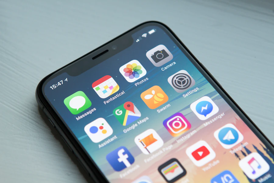
One Website. Every Screen. Zero Compromise.

Over 80% of Kenyan web traffic comes from mobile devices. Techhold Developers is Nairobi's top responsive web design agency — building mobile-first, cross-device websites that perform beautifully on every screen your customers use.

📱
320+ Responsive Sites Launched
⚡
< 2s Mobile Load Times
📈
+195% Avg. Mobile Conversions
techholddev.com

Responsive Website Design for Kenyan Businesses

Beautiful on every screen, from phones to desktops.

Get Started
Responsive Design

Tablet-optimized

Explore
Mobile-First

Where most users find you.

Start

Why Non-Responsive Websites Cost Kenyan Businesses Revenue

A website that works on desktop but fails on mobile is a website that loses most of its audience before they even start. Here's what breaks without responsive design.

📱

Mobile Traffic Lost

Over 80% of Kenyan users are on mobile. A desktop-only site pushes them away instantly.

📉

Google Rankings Drop

Google uses mobile-first indexing. Poor mobile experience means poor rankings — full stop.

🐌

Slow Mobile Load Times

Non-optimized images and heavy code kill performance on 3G and 4G networks.

👆

Broken Touch Experience

Tiny tap targets, hover-only menus, and horizontal scrolling frustrate mobile users.

📉

Low Mobile Conversion

Users abandon sites that are hard to use on mobile. Every friction point costs you revenue.

🖥️

Tablet & Wide-Screen Breakage

Even on desktop, non-responsive sites look broken at larger or ultra-wide resolutions.

Our Responsive Website Design Services

Complete responsive website design and development services for Kenyan businesses — from new builds to full responsive redesigns.

📱

Mobile-First Website Design

Designing for mobile first, then scaling up — not the other way around.

💻

Desktop & Wide-Screen Design

Layouts that look great from small phones to ultra-wide monitors.

🖥️

Tablet-Optimized Layouts

Tablet-specific experiences that break neither mobile nor desktop rules.

🔄

Responsive Redesigns

Convert non-responsive legacy sites into modern, mobile-first experiences.

⚡

Mobile Speed Optimization

Image compression, lazy loading, and Core Web Vitals for mobile-first performance.

👆

Touch-Optimized Interactions

Tap targets, swipe gestures, and mobile-native interaction patterns.

🔍

Mobile-First SEO

Aligned with Google's mobile-first indexing for maximum search visibility.

🖼️

Responsive Media & Images

Adaptive images and media that look beautiful at every screen size.

🧪

Cross-Device Testing

Testing across real devices — iOS, Android, tablets, and desktop browsers.

♿

Accessibility on All Devices

WCAG-aligned responsive design that works for every user, every device.

🔗

Cross-Device Integrations

Forms, payments, and booking flows that work seamlessly on any device.

🛠️

Ongoing Responsive Support

Continuous improvements as new devices and screen sizes emerge.

Our Responsive Design Process

A structured, device-obsessed process that leaves no screen untested.

01 — DISCOVER

Discover & Device Audit

Audience, device mix, competitors, and technical requirements.

02 — DESIGN

Mobile-First Design

Wireframes, prototypes, and design system starting at 320px.

03 — BUILD

Responsive Build & Test

Fluid layouts, adaptive media, and cross-device testing.

04 — LAUNCH

Launch & Monitor

Deployment, analytics, and ongoing responsive performance tracking.

We Design for Every Breakpoint

Responsive design isn't just "mobile and desktop". We design and test for every screen your customers actually use — from small phones to ultra-wide monitors.

📱

Small Mobile

320px – 480px

iPhone SE, small Androids

📱

Standard Mobile

480px – 768px

Most modern smartphones

🖥️

Tablets

768px – 1024px

iPad, Android tablets

💻

Laptops

1024px – 1440px

Standard laptop screens

🖥️

Desktop & Wide

1440px+

Large monitors & ultra-wide

We Design for Mobile. Then Scale Up.

Mobile-first isn't a trend — it's how Kenyan users actually browse. We design every website starting at the smallest screen, then progressively enhance for tablets, laptops, and desktops.

  • Content and layout designed at 320px first
  • Touch-optimized interactions and tap targets
  • Prioritized content hierarchy for small screens
  • Mobile-native navigation patterns
  • Aligned with Google's mobile-first indexing
  • Fast loading on 3G and 4G networks
Mobile-first responsive website design for Nairobi businesses

Fast on Mobile, Every Time

Responsive design means nothing without speed. We optimize every part of your site for mobile performance — from images to scripts — so pages load in under 2 seconds even on slower Kenyan networks.

  • Responsive and adaptive image loading
  • Modern formats (WebP, AVIF)
  • Lazy loading for images and video
  • Critical CSS and minimal JavaScript
  • CDN and edge caching
  • Core Web Vitals optimization for mobile
Mobile speed optimization for responsive websites in Kenya

Every Responsive Website We Build Includes

Non-negotiable features baked into every responsive website we ship.

📱

Mobile-First Design

Designed from the smallest screen upward.

⚡

Fast on All Networks

Optimized for 3G, 4G, and WiFi speeds.

👆

Touch-Optimized

Tap targets, gestures, and mobile-native UX.

🖼️

Responsive Media

Images and video that scale beautifully.

🔍

Mobile-First SEO

Aligned with Google's mobile-first indexing.

♿

Accessible on All Devices

Works for every user, on every screen.

🔄

Future-Proof

Adapts to new screen sizes and devices.

🧪

Cross-Device Tested

Tested on real iOS, Android, and desktop devices.

Responsive Design Deliverables

Every project produces documented, cross-device-ready outputs — not just a live URL.

✓

Device Audit Report

Audience and device mix analysis for your market.

✓

Mobile-First Wireframes

Designs starting at 320px and scaling up.

✓

Responsive Design System

Components that adapt fluidly across all breakpoints.

✓

Fully Responsive Website

Responsive, fast, secure, and SEO-ready.

✓

Cross-Device Test Report

Tested on real iOS, Android, tablet, and desktop devices.

✓

Mobile Speed Report

Core Web Vitals and PageSpeed scores for mobile and desktop.

✓

CMS & Admin Training

Video and live training to update content safely.

✓

Analytics & Tracking Setup

GA4, GTM, and device-level conversion tracking.

✓

Post-Launch Support

30-day warranty plus optional maintenance plans.

Responsive Website Case Study

How a Nairobi business tripled mobile conversions with a full responsive rebuild.

Responsive website case study for Nairobi business

Nairobi Services Business

Problem: Desktop-focused website that broke on mobile, 8.4s mobile load time, tiny tap targets, and 62% mobile bounce rate.

Solution: Full responsive rebuild with mobile-first design, adaptive images, CDN, and device-specific optimization across all breakpoints.

+312%
Mobile Conversions
-76%
Mobile Load Time
-58%
Mobile Bounce Rate
5
Weeks to Launch

What Our Clients Say

Real outcomes from Techhold Developers' responsive website design services.

★★★★★

"Our old site was a disaster on mobile. Techhold rebuilt it mobile-first and our mobile conversions tripled. The difference on Android especially was night and day."

★★★★★

"The new site works beautifully on my iPhone, my laptop, and my tablet. Our Google rankings improved too. Highly recommended for any Nairobi business."

Responsive Website Design FAQs

Answers to the questions we hear most from Nairobi businesses.

How much does responsive website design cost in Nairobi?
Responsive website design in Nairobi typically ranges from KES 80,000 for a professional business website to KES 800,000+ for complex eCommerce or enterprise sites. Techhold Developers provides fixed-scope quotes after a discovery call.
What is responsive website design?
Responsive website design is an approach where a website's layout, content, and functionality automatically adapt to fit the screen size, device, and orientation of the user — from smartphones and tablets to laptops and large desktop monitors.
Why is mobile-first design important for Kenyan websites?
Over 80% of Kenyan web traffic comes from mobile devices. Google uses mobile-first indexing, meaning the mobile version of your site is what Google primarily uses to rank you. A mobile-first responsive design is no longer optional — it's the baseline.
Will responsive design improve my SEO rankings?
Yes. Google uses mobile-first indexing, meaning your mobile site determines your rankings. Responsive design aligned to mobile-first best practices — fast load times, proper tap targets, no horizontal scroll — directly improves your search visibility.
Can you redesign my existing non-responsive website?
Yes. We specialize in converting desktop-only legacy websites into modern, mobile-first responsive experiences — while preserving your SEO equity, traffic, and brand history.
How do you test responsive designs?
We test on real devices (iOS and Android), tablets, and desktop browsers at multiple breakpoints — from 320px small phones to 1920px+ monitors. We also use automated testing tools and Google's Mobile-Friendly test.
Do you provide ongoing responsive maintenance?
Yes. We offer monthly maintenance plans covering device testing, browser compatibility checks, responsive performance monitoring, and content updates as new devices and screen sizes emerge.
Do you work with businesses outside Nairobi?
Yes. We deliver responsive website design services to businesses across Kenya — including Mombasa, Kisumu, Nakuru, Eldoret, and Thika — and internationally. All work is delivered remotely with video reviews and shared project dashboards.

Get Your Responsive Website Audit

We'll review your current website across devices — mobile, tablet, laptop, and desktop — plus speed, SEO, and mobile UX. You'll get a prioritised action plan. No obligation, no jargon.

Request Audit →
Mobile UX review
Cross-device testing
Mobile speed & CWV check
Touch target audit
Mobile SEO review
Content hierarchy check
Competitor comparison
30-min strategy call